In 1837 Georg Ohm discovered the Ohm’s law. Out of the many applications that we have from his law, one of the most seminal ones is the earth wire.
When current leaks, it would invariably go through the earth wire, the reason for it being that it offers the least resistance for the flow of current.
This fact has probably saved thousands of lives.
There’s something remarkably similar between the way how current flows and how the human mind works.
Our mind chooses the path of least resistance when it’s given a work (for the majority of us). It would try to find the easiest way to get a job done and once the mind has figured out a solution, we stop thinking and simply follow the solution.
So, a person reading a webpage is always more likely to click a link that’s easier to spot (lower resistance).
We generally tend to behave in a way, which conserves energy. Call it the behavior ingrained in us by evolution or call it something programmed into our genes.
We would rather drive than walk, copy than come up with something original. You’ll always have exceptions but this is true for a large majority.
Our brains have evolved to be “brilliantly uncreative.” Edward de Bono.
We make hundreds or thousands of decisions each and every day – Small, subtle decisions, big decisions, unconscious decisions. Because of the large number of decisions to be made a time comes when we start creating mental models and following a set pattern, a set pattern of eating, of browsing a web page, of reading etc.
Key Takeaway: Users are more likely to click on links, which are easier to spot.
Primacy and Recency
Have you ever noticed that when given a random series of names or numbers we tend to remember the ones that were shown to us first. Our mind operates in a way that tends to favor the first few things in order. It’s called the Primacy Effect. The last few items in a list also tend to be remembered more often, which is called the Recency effect.
The Primacy effect comes into play when selecting links too. We tend to go for links that are located closest to us.
A research paper by the University of Western Australia indicates that people noticed Yellow page ads with color before the ones without color. They saw more quarter page ads than smaller listings. When given categories they chose the ones, which came first.
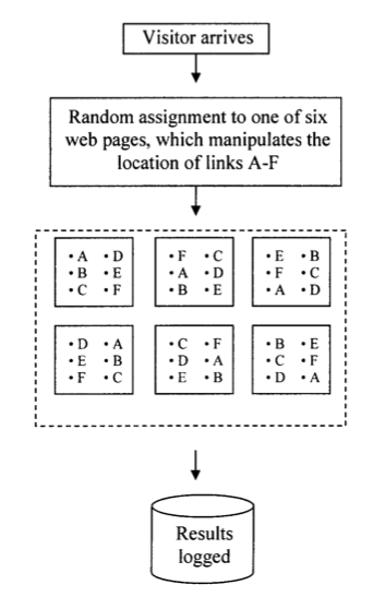
An experiment was conducted with 12 web pages where the position of the link was varied. Researchers noted that the clicks on the link went ranged from 1% to 20% in certain positions.
These figures also show a position effect. The worst performing position was the middle link in the right column. The bottom link did better in the right column than in the left column, which again suggests the play of Recency effect. The upper left and the lower right links captured the most clicks.
Key Takeaway: Users are more likely to click on Links, which are placed near the beginning of a list or near the end.
User Experience
To ensure that your readers view your links, you need to first ensure that they read your page or article. Let’s look at how we can ensure that more readers like your design and read your content:
- Remember that people don’t actually read but scan through your page. So make your content scan friendly. Create short paragraphs, use a lot of bullets, bold out the important content and use images.
- When it comes to Design, Simple is always better. YouTube’s UX Researcher Javier Bargas Avila conducted experiments in 2012 to figure out what makes users like a page’s design. An interesting observation was that user can form an aesthetic judgment about your design between 17 and 50 milliseconds. The highlight here was that if the visual complexity of a website is high, users perceive it as less beautiful, even if the design is familiar.
- Typography also affects your readers. An experiment done by Kevin and Rosalind, clearly displayed that when a passage is typographically well structured and designed, the readers are more engrossed in the text, so it is more likely they will notice your link.
Key Takeaway: Scannable content, a good font with a less complex page design (visually) will ensure users reader stay longer on your web page and become more likely to notice your link.
Psychology of Choice
In the book Paradox of Choice Barry Schwartz says that clinging tenaciously to all the choices that we have, makes life bitter. It contributes to anxiety, stress and overall dissatisfaction.

“Advertising has us chasing cars and clothes, working jobs we hate so we can buy shit we don’t need.” – Tyler Durden, Fight Club.
Barry states cable television to be the ultimate example of the splatter of choices that we have. We have so many choices, so many options that we may go without making a single selection.
Limit the number of choices so that people find it easy to choose something. Sheena Iyengar of Columbia Business School describes about an experiment that she did in a luxury store – the Menlo Park Draeger’s that offered hundreds of varieties in every item they sold.
They had 300 different flavors of Jam alone.
Sheena tested with two different sets of Jams. First, an assortment of 24 kinds of jams at one time and an assortment of 6 kinds at another time. When the number of choices was bigger it pulled a larger crowd but at the end of the day it was discovered that 30% of the people who saw the small sample decided to buy the jam while only 3% of the people who saw the larger sample decided to buy jams.
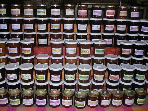
The crowd pulling can be attributed to the fact that people love new. Nobody wants to miss 24 jams on the aisle or flavors they haven’t seen in jam before.
But, choice actually strips you off the freedom of choice. When given many choices there arise an equivalent number of questions when shortlisting before these choices. Higher number of options generally persuades us to try everything because we’re born to seek. We cling tenaciously to all choices and none of them make us happy.
Key Takeaway: By limiting the number of options, you increase the probability of someone clicking and reading.
Emotional Triggers
Emotions, emotions and just emotions. We are emotional beings; we weep for make-believe worlds and live the reality of a 2 hour long super hero. Behind each click there’s a person.
A click is an extension of our interest. An interest that has been piqued but not fulfilled. Click is the first step towards the fulfillment of the desire, which brings me to my next long awaited point- Dopamine.
We seek and devour new information. Dopamine is the chemical that makes us to do so. A part of body’s natural reward system, it intoxicates us and fashions our thoughts and actions in more ways than we fathom.
Bring to your thoughts the last time you bought that car or that watch. You felt happy, you certainly will, but only for sometime, a brief moment. The desire to attain that watch or car was replaced with some other shiny object once you get that watch or car.
You were as happy or sad as you were before.
We are never rewarded truly but as Will Smith puts it in the critically acclaimed movie “The Pursuit of Happyness”:
“It was right then that I started thinking about Thomas Jefferson on the Declaration of Independence and the part about our right to life, liberty, and the pursuit of happiness. And I remember thinking how did he know to put the pursuit part in there? That maybe happiness is something that we can only pursue and maybe we can actually never have it. No matter what. How did he know that?”
We can’t help but search for new information. Your links, your headlines should be crafted in a way that it sets the release of Dopamine, triggers the release of chemicals that promise happiness.
Don’t offer any excessive amount of information in your feeds, in your newsletters. That would either kill the curiosity or the cat, I don’t know but it certainly will not help you.
Well that isn’t too bad because our brain in reality never seeks happiness. It just seeks survival and will do anything to take you to the next step as in the carrot and stick model.
Key Takeaway: The anchor text is like a short sales pitch – it should highlight the benefit which the page (being linked to) offers.
On anchor texts and placements of links
The charmless click here
Often we’re tempted to leave our links anchored as mere “click here” or “go to” or some charmless unexciting half dead block of text that cannot inspire anyone to do anything.
Keeping our earlier research on people trying to expend as little mental energy as possible, we need to realize that a “click here” anchor doesn’t give them a reason to click there until and unless they hover their mouse over the link. That requires energy.
So what should your anchors say?
Based on an article titled Why Your Links Should Never Say – Click Here, the anchor texts should consist of nouns so that it defines something that people can visualize.
Proper nouns are even better because they represent unique elements; they paint a clear picture and are not much exacting on the brain.
You should avoid using verbs because verbs are vague and generally never convey a solid idea of what we’re trying to say.
Finally always try to place a link at the end of a sentence so that people are not torn between deciding to complete the sentence or click on the link. Make it easier on them. Having the desire to click a link is not enough; your placement should also be feasible so that the user affords that desire.
On the other hand an anchor like “weight loss tips” gives a certain clue to the reader and generates an interest in the right kind of audience.
A business is built on repeat customers. Do not oversell. Do not under deliver. The promise of short lived but pure entertainment is what keeps them coming back.
Make your philosophy on that.
Key Takeaway: Use nouns in the anchor text and try to place the links at the end of the sentence.
Ankit is a co-founder @ AdPushup (a tool which helps online publishers optimize ad revenues) and loves online marketing & growth hacking.

