Testing button colours is a starting point in any growth marketer’s career. I’m not saying it doesn’t work; it has worked great for many (case in point: Mitt Romney’s election campaign). I’m sure you’ve done other A/B tests like these, but I’m also quite sure you learned nothing much from testing a small change.
Kaiser Fung estimates that 80-90% tests yield insignificant results. That’s a lot of time and effort down the drain; not to mention the dawning realization that you have no idea what you’re doing when it comes to conversion rate optimization.
The way I see it is: Meaningless tests have been talked about so often that they seem like the magic solution to getting great conversions for everyone. We don’t want to come up with new hypotheses because that’s like, so exhausting.
Who has the time to look at behavioral data, find a problem area, do the necessary research, and make some informed guesses about how to fix it? It’s easier to look at what others have had success with, do the same, and expect similarly amazing results.
Well, guess what: Every case study on Tests of the Week is specific to the context of one particular website. Your website is unique (different audience, niche, long-term goals, everything…) and has a very, very specific set of problems. You can’t form an educated guess about your website based on what a completely different site has done.
My beef is NOT with A/B testing itself. What pains me are the things publishers are testing and why.
This post addresses some of the more important issues, blog-specific changes publishers ought to test and improve. Not the button color. Because making the button color stand out from the rest of the design is a design principle, and there’s only so many times you can test it and get meaningful insights.
“Insanity is doing the same thing over and over again and expecting different results.” – Albert Einstein
The Method
You can weed out a lot of meaningless test hypotheses by asking meaty questions about what matters to your readers.
Since you have likely made your “subscribe now” button pop (I know I’m harping on, I am wholly unapologetic), try a different approach. Ask your readers what they expected when they landed on a particular page. Do a qualitative analysis. After that:
1. Set a baseline
This is your current standard. Identify your average conversion rate over a significantly long period of time before you work on raising it. Then check out how the top competitors (in your specific niche) are doing to find your standing, subjectively.
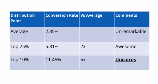
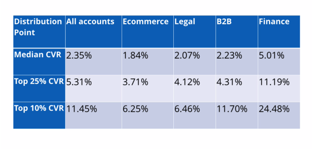
KissMetrics found a pattern from their data (shared in The 10 Weirdest A/B Tests Webinar):


Why do I mention this: Your competitors are in similar boats (in terms of audience demographics and interests, content, site structure, design, etc.) and if you were to take testing ideas from someone, they are a safer choice than just another random website.
2. Identify key metrics
These are questions backed by your specific behavioral data. Your primary goals should concern improvements on one or more of the following: Pageviews per session on content, menu interactions and search engagement on category page and home page, scroll depth, video completions, social button interactions, et al.

3. Create multiple variants
For instance, if your primary goal is to improve ad viewability, identify a list of elements that directly impact it (more on this in a moment). Make enough variants to thoroughly test a single element.
Now for some a/b testing ideas for a blog, here’s a list separated by broader goals.
Note: For your own sake, DO NOT take the following ideas at my word. Pair them with your blog’s own context, analytics, and user research data first.
> Optimization Goal: Readability
Note that I said readability and not legibility. People often use it interchangeably, but there’s a difference: Readability depends on content (vocab and syntax) as well as typography (font, character spacing, line height et al). Legibility depends only on the latter.
Readability is a measure of how well your content is read and understood by your audience.
Focus on this when your text content pages are not getting enough time-on-page.
Typical testing grounds include design tweaks like typeface, font size, line height, character space, background-text color combinations, etc.
Content experiments focused on re-wording headlines, subheads, image captions, and F-Pattern areas within the content (i.e.: scannable elements) with an aim to improve coherence and reduce soul-crushing jargon.
Some more testing ideas:
- Text-Image ratio
- Line and Paragraph lengths
- Drop-caps (and other dramatic tweaks on copy aesthetics)
Monitor and measure: Time-on-page, scroll depth, clicks/interactions with elements placed lower on the page.
Note: Always keep visitor expectation upfront. Technical jargon may be typically long, uncommon and difficult to understand, but acceptable for a specific niche audience.
> Optimization Goal: Ad Viewability
I have talked about the importance of ad viewability before. Your advertisers, by the way, love this metric and will likely measure your inventory’s worth by number of viewable impressions in near future.
If you’re unfamiliar with the term and unwilling to read another freaking post, here’s the simplest version of it: Ad viewability measures what percentage of an ad stays visible and for how long.
Focus on this for increased engagement, improved Active View metrics (for publishers using Google advertising products like AdSense, DFP, DoubleClick AdX), and to enhance long-term value of your ad inventory.
Typical testing grounds will include ad sizes, vertical vs. horizontal ad units, on-page position w.r.t. content, etc. Check out The Importance of Being Seen by Google to see the findings and apply them to your blog’s experience.
Monitor and Measure: Active View viewable metrics (for text and video ads), CTR.
> Optimization Goal: Ease of Navigation
Your visitors’ collective hatred will set your soul on fire if your site’s navigation is messed up. Most common culprits are blogs with a number of categories and subcategories that are just squeezed in the top nav bar like whatever.
Before you test anything, work on ensuring that the main navigation follows the much-touted 3-click-rule (not to the letter, but you get the point about simplicity) — get your visitors where they want to go in as few clicks as possible.
Focus on engagement with site navigation (primary and secondary) when you see consistently low pageviews per session and high homepage bounce rate.
Testing grounds should include hover states on main navigation with subcategories, top stories, and images; reducing main nav categories (duh!), different navigation types (left or right navigation panel for subcategories on content pages, for instance), footer menu et al.
Some more testing ideas:
- Highlighting a single menu tab (for categories that are new/ need more traffic / lead to landing page(s))
- Aesthetic tweaks in breadcrumbs (optimize for prominence with changes in colors and text size)
- Hover state on Related Content modules (make them stand out more to get visitors to pay attention)
Additional Ideas
- Capturing opt-in email addresses via dedicated landing page(s) vs. pop-ups vs. squeeze pages vs. sidebar form
- Personalized navigation (using site cookies)
- Comments section active vs. disabled
- Video thumbnails: More on page vs. fewer and larger
- Site search box positions
- Targeting affiliate product/offer pages by audience demographics using site cookies
- Focal points in images, illustrations, and signup forms (as detailed here)
…and anything else you can glean from your qualitative and quantitative data
The point of this post was to make you think of A/B tests as less of a trial-and-error process and more in terms of highly specific research.
If you’re optimizing, you will have failed tests that yield no conclusive, significant insights about blog experience or user behavior. But that’s okay.
Just remember that your goal as a growth marketer is to learn how to reduce the number of failed tests and win.
It’ll take some work but keep testing with informed hypotheses instead of randomly throwing balls at a wall and expecting them to stick.

Shubham is a digital marketer with rich experience working in the advertisement technology industry. He has vast experience in the programmatic industry, driving business strategy and scaling functions including but not limited to growth and marketing, Operations, process optimization, and Sales.


