In the fight against ad blockers, publishers have a secret weapon: The ability to create ad experiences that keep users happy. Here’s what you need to know.
A new report published by GlobalWebIndex estimates that ad block usage in the US currently stands at 40% for laptops and 15% for mobile devices. Roughly speaking, that’s almost half the ad revenue that a publisher could have been earning—gone, just like that.
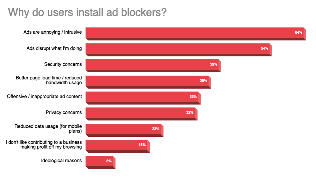
Apart from quantitative analysis such as adoption numbers, device penetration, and country-wise usage data, researchers have tried to determine why users install ad blockers. Most user surveys have revealed that it’s a combination of reasons, rather than any single one.
Why Worry About “Ad Experience”?
Clearly, publishers cannot control all the factors listed above. For instance, if someone is ideologically opposed to ads, there isn’t much you can do about it. However, there are a lot of factors that publishers can control. If a user says that his/her ad experience is disruptive, it’s an experience directly created and controlled by publishers. And publishers can fix that.
In a lot of cases, publishers think that the more ad units they serve on a webpage, the more revenue they will earn. Or that intrusive ad formats will be more profitable. They do this without accounting for the fact that beyond a point, they will just tip their users towards using ad blockers, effectively cutting off all ad revenue from that cohort. This is why the ability to create better ad experiences should be an important part of every web publisher’s toolkit.
What Kind of Ads Doesn’t Work?
- Ads that annoy:
Imagine that you’re visiting a news article and are presented with an ad that has a countdown of 10 seconds. Ads that break the flow of information for users, especially on mobile devices, are frequently cited as the most annoying ads
- Ads that distract:
It takes users a very small amount of time to form an impression about your website. If they’re bombarded with flashing animations, bizarre color schemes, and auto-playing sound, their visit will probably end in site abandonment
- Ads that clutter:
Load times increase in proportion to the number of ad units being served on the web page. High-density ad layouts create slower experiences compared to sites with fewer ads and similar creative assets. Reducing the ad density can help improve user experience.
Identifying and Removing Least Desirable Ads
Understanding the need to clean up the advertising supply chain, The Coalition for Better Ads was formed a few years ago, and counts some of the biggest ad tech companies like Google, AppNexus, and Criteo, and regulatory bodies like IAB and ANA amongst its members.
Advertising helps support valuable free content, robust journalism and social connections across the internet. Consumers, however, are increasingly frustrated with ads that disrupt their experience, interrupt content and slow browsing. Leading international trade associations and companies involved in online media formed the Coalition for Better Ads to improve consumers’ experience with online advertising.
Since its inception, the Coalition for Better Ads has released multiple updates of the Better Ads Standard—a ranking of the most and least desirable ad formats in digital advertising. Publishers will do well to learn about and eliminate the least desirable formats laid down by the Better Ads Standard from their inventory. Here’s what that includes:
Least desirable ads on desktop
- Pop-up ads
- Auto-playing videos with sound
- Prestitial ads with a countdown
- Large sticky ads
Least desirable ads on mobile
- Pop-up ads
- Prestitial ads
- Mobile pages with more than 30% ad density
- Flashing animations
- Poststitial ads that require a countdown to dismiss
- Fullscreen scroll-over ads
- Large sticky ads
- Auto-playing videos with sound
Want another reason to do this? Chrome will start blocking ads that don’t comply with the Better Ads Standard starting July of this year. Since Chrome is the most popular browser in the world, what this means is that publishers who don’t clean up their ad experience and continue serving non-compliant ad formats will see their ad revenues plunging to all new lows.

Creating Better Ad Layouts, for Desktop and Mobile
Hopefully, by now, you’ve gotten rid of the most intrusive ad formats. So, what next? Well, now you re-create your ad layout with ads that are better-received by users. When choosing the formats, it’s important to treat desktop and mobile devices differently because of the difference in their screen size and also how users interact with content on them.
On desktop, users are not generally restrained by screen size and bandwidth, so they are more interested in controlling the flow of information without being interrupted. If you want to offer the advertisers large canvas space, you can consider takeover ads and dismissable prestitial ads. Here are some other formats that work well on desktop:
- Long, skinny ad on the right-hand size (such as 300×600 half-page)
- Static large image ad at the top (such as 728×90 leaderboard)
- Static inline ad
- Sticky ad in sidebar
- Ideal refresh interval: 30 seconds
On mobile, users are looking for speed and convenience before anything else, so large ad formats that obscure content are seen as the most annoying. Instead of a pop-up, try a full-screen inline ad—they offer the same space without hiding content. You can also try a dismissible poststitial ad. Here are some other formats that work well on mobile:
- Small sticky ads on top and bottom
- Best sizes: 320×50 and 320×100
- Small static inline ad
- Click-to-play inline video ad
- Ideal refresh interval: 30 seconds
Diagnosing with the Ad Experience Report
Google recently released a tool called the Ad Experience Report to help web publishers identify and fix components of their ad layouts that violate the Better Ads Standard. The first step is verifying your website, once that’s done, your website will be reviewed, and receive one of the following three status: Passed, Warning, and Failing.
If your website passes the Ad Experience Report, congratulations, no annoying ads were found on your website, and you can continue doing what you were doing. However, if you get a Warning or Failing status, it means that you are using ads that harm user experience and need to make changes to your ad layout to improve it for usability.
The Ad Experience report is generated separately for desktop and mobile, since an ad that may be annoying on mobile may work well on desktop and vice-versa. Identified issues are tagged under the categories site design issues and creative issues, once the publisher has made the necessary changes to their ad layout, they can send in their website for a second review.
Conclusion
With ad block usage growing year-on-year, publishers cannot afford to take a passive stance in creating ad layouts. Every ad placement should be a consequence of a well thought out strategy that takes not just revenue, but user experience in account. Users interact differently with content on desktop and mobile, therefore the ad formats you choose should reflect this
Later this year, Chrome will start blocking ads on websites that don’t comply with the Better Ads Standard. Publishers need to use a three-step approach in preparation for this.
- Remove ad formats that do not comply with the Better Ads Standard.
- Replace them with desirable ad formats for desktop and mobile.
- Use the Ad Experience Report to diagnose any remaining issues.
Changing and improving your ad layout can be a challenging endeavor that requires time, effort, and expertise. It is possible that you may even witness some fluctuations in ad revenue in the short-term, but creating better ad experience is the best survival strategy for the long term.
FAQs
An ad experience includes your site’s layout, behavior, content, and ads.
Your advertising should ideally capture the attention of prospective customers and entice them to use your product. All your advertising should reflect your business’s unique positioning statement, regardless of the method.
The Ad Experience Report identifies ad experiences on your site that violate the Better Ads Standards, a set of ad experiences that the Coalition for Better Ads has determined are highly irritating to users.

Shubham is a digital marketer with rich experience working in the advertisement technology industry. He has vast experience in the programmatic industry, driving business strategy and scaling functions including but not limited to growth and marketing, Operations, process optimization, and Sales.


