Banner blindness is almost a timeless user practice where they tend to consciously or subconsciously ignore banner advertisements.
It is crucial to place more emphasis on consumer habits when it pertains to digital platforms and develop innovative engagement strategies. The major objective must be to comprehend what clients desire and need.
As we know, banner advertising is a widely used method for monetizing websites. But at the same time, as it stands right now in terms of promotion, it fails to generate enough revenue for publishers or provide significant ROI for the majority of advertisers.
Let’s look at some Stats:
- The ad spending on banner advertising is projected to cross US$61.01bn in 2022.
- About 5.3 trillion display ads were served to U.S users, but 3 in 10 ads were never seen in 2012 (Tweet this).
- An average Internet user is exposed to 1,707 banner ads in one month (Tweet this).
- Want to know the average click-through rate of banner ads? It’s a mere 0.11% (Tweet this).
Here is what Ad Rech Experts Recommended to Reduce Banner Blindness
So in this article, we’ll focus on one of the major culprits responsible for this horrifyingly low response rateーbanner blindness. Not just that, we’ll also explore some powerful ways to minimize the effects of banner blindness which help publishers significantly improve their ad revenue.
What Is Banner Blindness?
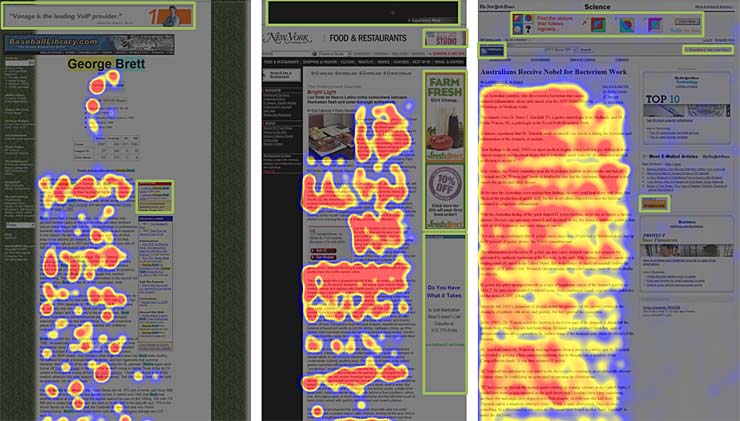
Banner blindness refers to a phenomenon whereby website users consciously or unconsciously ignore or skip banner advertisements or information present in a banner-like fashion.
One metric used to indicate the effectiveness of a particular banner is its Click-Through Rate (CTR).
→ Formula: # of clicks ÷ # of ad impressions X 100 = % CTR
→ Example: 5 clicks ÷ 100 ad impressions X 100 = 5% CTR
Benway and Lane coined the term ‘Banner Blindness’ in 1998. They found that even after making large, attention-grabbing, and brightly colored banners, participants still ignore ads while they were looking for specific information to complete the assigned task; an outcome of banner blindness. The banners were also ignored even when they were embedded with helpful information regarding that very task.
They also found banners located on top of the page (away from important links) were more ignored more than those located on the lower page (near important links). Experts believe, when users browse through a website, they’re in a ‘search mode’. Hence, they ignore anything irrelevant.
The Information Overload
It has been long believed that a thing has to be conspicuous and visually different to get something noticed. However, research on banner blindness shows that links and messages which stand out from the content are often skipped or ignored.
How is information overload affecting our readers from noticing the banner displays?
Psychologists believe, we are are becoming less capable of comprehending all the information presented to us because of the overwhelming amount of information that is bombarded onto us from different media sources (television, radio, telephone).
With the Internet, people have access to all kinds of information. So with the increase in amount of websites and blogs claiming to be the #1 source, people are finding it hard to identify quality content. A reason why banner blindness is on the rise.
Plus, people are learning that more information does not always equate to better information. Mostly because Internet sources are being advertised on TV ads and radio commercials,
When people browse a website, they’re usually looking for specific information. They skip over irrelevant content and look through ‘scannable’ content like navigation bars, lists or headings.
What Jakob Nielsen tested in 1997 is still relevant today. People are leaning to tune out ‘fluff’ so they can avert the occurrence of information overload.
Cognitive Schemata
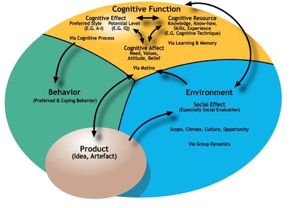
According to Don Norman, co-founder of Nielsen Norman group, online users often use cognitive schema when they find themselves on a new website.
A cognitive schema is a mental framework which helps organize knowledge, expectations, and beliefs for a particular topic. These are vital because they help us take shortcuts when we are in a similar environment again.
When users find themselves on a new website, they use stored schemas. These help them direct their focus to promising areas where they expect to find the information they are looking for areas where they found the info when they were faced with the same situation previously.
Similarly, this is how it’s leading to banner blindness in the ad world. The cognitive state of mind of users often leads to traditional ad locations, like the right side of a web page, being ignored.
How It Affects Publishers/Bloggers/Webmasters
Placing banner ads where users can’t see or are primed to ignore them can affect click-through rates. Areas like the top-right corner of the website or the right sidebar are often skipped because people consciously/subconsciously associate them with ad areas.
In the beginning, when banner ads were just starting to appear on websites, it was found that curiosity leads people to click on anything ‘shiny’ or convincing. Over the years, though, with websites flooded with ads, people have become habituated and have learned to ignore them.
This is obviously bad news for bloggers and webmasters who work to monetize their blogs through PPC-based ads; occurrence of default banner blindness behaviour.
How Do We Find These Blind Ad Spots?
Fortunately, there is some robust analytical software available today that helps bloggers and webmasters measure the effectiveness of their current ad placements.
Eye Tracking Usability Testing and Heatmaps
These have been used for digital research experiments as means to measure a user’s cognitive activity for a very long time. For websites, it’s a process wherein users’ optical movements are tracked and analyzed to improve the conversion rate. It’s one of the methods to combat banner blindness.
The data collected through this process provides insights about:
- what type of content is attracting their attention (images, texts, videos, etc.)
- which part of the web page visitors are focusing on
- what spots are they ignoring
It also shows how far along the visitors scroll down the page, whether they’re just scanning or reading through the page, and how they’re navigating the website. These insights are crucial to understanding factors contributing in the increased scale of banner blindness.
Using these eye track patterns, testers can produce heatmaps. These heatmaps show which spots receive the most attention and which ones were ignored highlighted in dark. As a webmaster, if those blind spots contain any vital information or the ad units, you may want to rethink the layout.
Like most usability tests though, eye tracking in itself won’t tell you much on its own. To get the most out of these tests, you need to ask smart questions. Many experimenters go about gathering this data through task-oriented tests which focus on how a user went about completing a specific task.
Example Of Eye Tracking Tests
A study asked its participants to find the country’s current population on the U.S census bureau’s website. Even though the answer was located on the site’s homepage一top right corner in bright red color一it was found that 86% of participants failed to find the right answer.
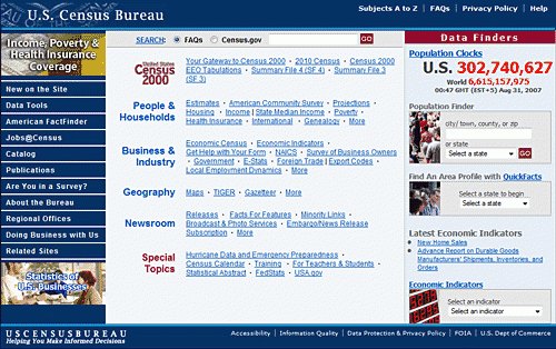
How were they able to skip such readable and clearly visible information? Reason, it’s heavily formatted and presented in a promotional, advertisement type format.
Heatmaps showed that users did scan that part of the website where the answer was located, but didn’t actually read the entire number; just the first three numbers. 1/3rd of the participants did not see the population clock. The users who did, most of them didn’t use it even though it contained the answer.
Therefore, results from eye tracking tests can be used to optimize web pages by changing layouts, colors, buttons and images, making the website more usable by placing the correct element at the correct place and fight the effects of banner blindness.
How Humans Read Web Pages
Banner blindness cannot be completely eliminated because of the varying and evolving user search pattern. However, its effects can be significantly minimized through appropriate testing and understanding how users behave while searching or accessing a website
A website comprises several different elements; each element varying in its level of importance. For a website to be profitable or for its goals (be it sales, opt-in, an ad click) to be met, ideally it needs to situate the right pieces at the right location.
Wouldn’t it be wonderful if you knew in advance about how people read a web page? Consequently, you’d know what to present them where and you get them to take the expected action. In this case, the action would be noticing the ad and clicking on it, provided it is relevant.
The good news is, several experiments have already been done to understand the general reading pattern of Internet users.
The F Pattern
In the F Pattern, a study by Jakob Neilsen, he observed the reading pattern of over 232 users. He found the dominant reading pattern which was consistent across all users resembled the letter ‘F.’
What he found was people first read in a horizontal fashion across the upper portion of the content section. Then they moved down the page and went on to read in another horizontal fashion. This time the movement across got shorter than before, like the second bar in the letter ‘F.’ Lastly, the users moved in a vertical fashion scanning left side of the page.
Of course, there are some exceptions to the above mentioned reading pattern. Some users might have a reading pattern that looks like the letter “X” or an inverted “L”. But the majority, roughly follow an “F” shaped pattern.
Another research that looked at attention and scrolling habits showed users spent 80% of their time above the fold and 20% below the fold. He also found users spent 69% of their time scanning the left side of the page while only 30% viewing the right.
The Gutenberg Design
This pattern gives a general idea about the eye movement patterns when a visitor views a content heavy page. According to Gutenberg rule, a webpage is divided into 4 quadrants一 primary optical area, strong fallow area, weak fallow area, and terminal area.
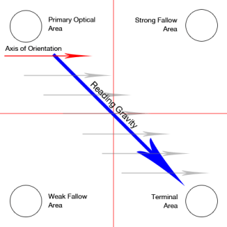
The primary optical area refers to the upper left section of the page. It receives the primary attention regardless of the users’ intention of using the website. Next, the user sweeps across to the second quadrant viz. the strong fallow area located at the upper right section of the page. This is the area where users will usually stop.
Then next section users sweep to is weak fallow area in the bottom left section. Users don’t generally pay a lot of attention to this section. Last comes the terminal area at the lower right section. This is considered a great spot to put any kind of call to action (CTA).
That said, it’s important to realize that these reading pattern strongly exist primarily in text heavy and evenly distributed web pages. In cases where you create your own visual hierarchy, the patterns mentioned above no longer apply.
In this case, the most dominant element acts as the focal point where most eyes first lay. The eyes will be pulled next to the element that is second in the visual weight order. Each element varies in visual weights, and that will dictate the order of the visitor’s eye path.
An eye tracking research found that website visitors spent 2.6 seconds scanning the website before focusing on a particular section. The 5 sections that drew their attention, in the order of the amount of time spent include:
- logo (6.48 seconds)
- main navigation (6.44 seconds)
- search bar (6 seconds)
- written content (5.59 seconds)
- website’s main image (5.94 seconds)
Impact Of Color Schemes
Colors can influence people physically and psychologically. Although this topic, just like all the other ones we have covered in this article, could be an article of its own, we are going to cover some important fundamentals without getting too technical.
Basics Of Color Theory
Colors evoke different reactions in different people. It’s seldom that we find one color in a website. Usually, we follow a color palette. Here’re three factors to keep in mind when thinking about color combinations:
- Complementation (how colors interact with each other)
- Contrast (used to create a sense of division between elements)
- Vibrancy aka the brightness or darkness (used to dictate mood)
Now, let’s look at some color schemes. Your color scheme will depend on your dominant color(s). This can come from your marketing material, logo, or your website’s context.
One great way to pick a dominant color is to first think of words that describe your website / company and then select color(s) that closely mirrors those words.
Monochromatic: With this scheme, your color palette contains different shades of the same color, be it blue, orange, green or any other color. When used, it can project an elegant and clean look. If needed, white and black colors are recommended to break the monotony.
Analogous: The color palette, in this case, will include colors that are right next to each other in the color wheel. Often times, one color will dominate, the second color supports the dominant color, and the third color acts as an accent.
Contrasting: These include colors that are found exactly opposite to each other. Example red-green, orange-blue, yellow-violet. The right contrast needs to be used to keep the look vibrant. In most cases, this scheme does not bring in good amount of clicks
Triadic: These include a triangle of three hues (colors) equally spaced out in the color wheel. The great thing about this scheme is it cannot look garish because each color balances out the other two.
How to Conquer Banner Blindness?
83% users exercise banner blindness. 54% users don’t click ads because of trust/malware issues. Only 8% users account for 85% of the clicks you get.
Clearly, your ads are getting ignore and high time you do something about it. Attributes like relevance score and actionability score are inevitable things factoring in the performance of your ad yield.
Here’re a few techniques you can practically implement to back your fight against banner blindness:
- Experiment with Ad Size, Color, and Placement
Standard ad sizes like 729×90 aka leaderboard and 320×250 rectangles are the most proven ones. Their typical placements look like this:
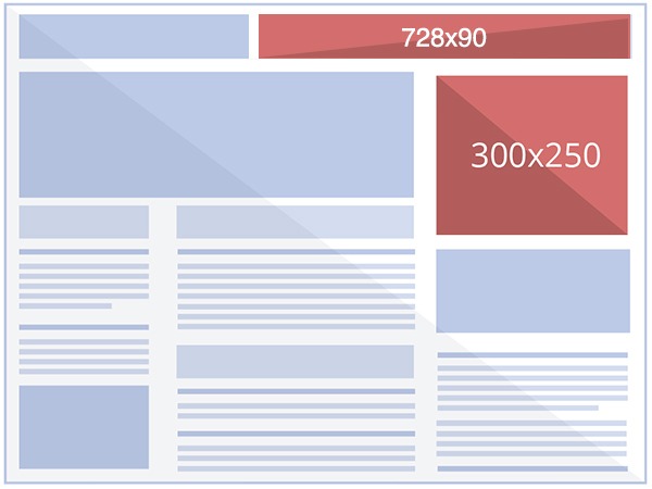
The thing is, people are accustomed to seeing ads on these spots. Hence, they unconsciously engage in banner blindness costing you your revenue. So, this is the time when you can challenge conventions and see if the other way around works for you.
Don’t be afraid to see if the most unexpected placements help your click-through rate. These days, welcome-page ads are the new way to engaging visitors and obtaining ad impressions simultaneously.
Sticky ads are also a good way to hold onto chances for getting impressions. But sticky is tricky. You’ve got to make sure the ads stick around, but decently (without affecting the on-site experience).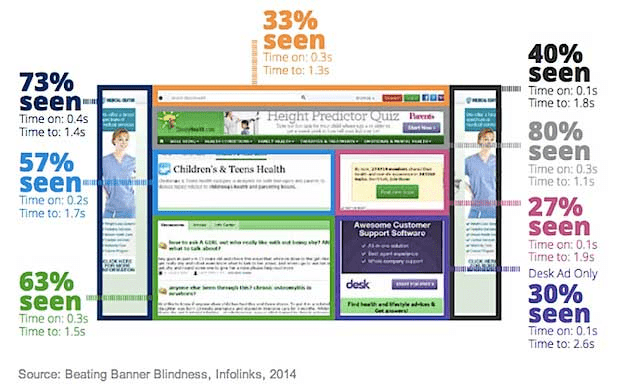
Another way is welcome-screen ads. These are quite trending these days. Take Forbes for example. You might notice a quote appearing (welcome screen) and then takes you to the article you tend to read.
Result? Publishers get impressions and visitors just get a good read. How nice!
We fairly discussed the size and placement. Similarly, color is also one element you can play with. It’s a matter of testing at all levels. The above cited color theories and schemes should help you take the required step. - Leverage Brand Recall Aka Retargeting
You must have a bucket full of visitors who come to your site and left in a short session. A good idea can be to follow around those people. Retargeting campaigns allow you to show your ads to your website visitors across the Internet.
Stats say, 25% users appreciate behaviorally targeted ads because it helps them recall their site visit and empowers the point of decision making
A typical retargeting cycle looks like this: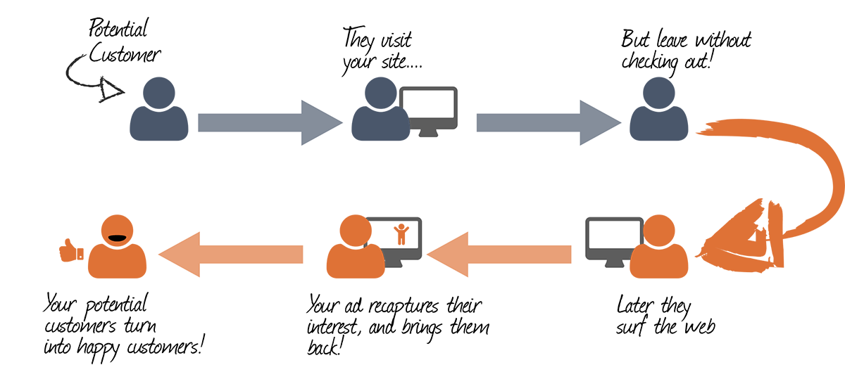 Image source: ReTargeter
The good part about retargeting is, it increases chances of bringing users back to your site. Alongside, the bandwidth of retargeting even lets you target users by placing ads on the sites you want.
Referred as managed placements, the following method is useful if you have an idea of the possible websites your kind of traffic usually visits. If you know the sites on your list support AdSense, you should start leveraging.
In crux, retargeting acts as a method to combat banner blindness prevailing on your website by again showing your ads to the same visitors at different sites. - Enhance Your Banner Ads for Mobile
These days, you must have a social and mobile presence if you want to keep up with the younger, smartphone-using audience. Consider the following when you do:
Utilize videos to display your ads.
Launching Facebook campaigns.
Adding a “Call Now” button to your advertisements. - Employ Pertinent Content on your Banner Ads
As a marketer, you must be aware of the requirements of your target market and also be able to provide an appropriate response:
Before delivering adverts, figure out what your visitors desire.
Include keywords that represent the preferences of the main audience in your relevant material.
Employ cookies to produce relevant personal adverts that will let your site recognize visitors who have already been there. - Engage in Affiliate Marketing
Through affiliate programs, you can collaborate with businesses that cater to similar customers. You can easily avoid banner blindness by placing your adverts on a publisher’s website linked with you.
- Take The 2-Step-Test
When defeating banner blindness is the aim, you yourself need to step into your audience’s shoes. Here are quick tests to decipher what users think and how they’d act to your ads:
Step #1: Grabbing Attention. Captivating Design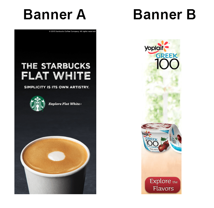 Image source: MarketingSherpa
Ask yourself, which ad do you think is more likely to:
strike to your retina
make you move your sight
hold your eyeball
Also, which ad would you think would stand out a minimalistic white background or busy page?
Step #2: Achieving Clicks. Giving or Asking?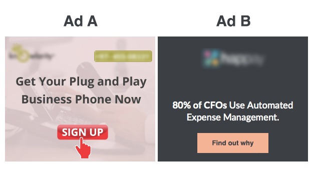
Ask yourself which ad for you is more compelling to take action (call to action)…
Does it offer value to a user, or is it asking you to make an effort?
Does the content resonate with you?
Which ad are you likely to click?
For a user who comes to your site to read or fulfil his intent (and not to see the ad), would you rather focus on giving something or instead ask for more? This aspect could be a different subject altogether on how to defeat banner blindness.
What’s Your Goal?
If your goal is to get more signups, it’s best to use a color scheme with colors that make the opt-in form stand out.
If your goal is to get more clicks, it’s best to make your ads blend-in with the rest of the content on your website. One way to do it is to make sure that the ad’s background, text and link color are the same as your post title, or text.
This way the unit will look like an internal link rather than an advert unit. Make sure that the borders are removed when you place them next to the post. Having said that, no two websites are alike and I have seen sites, which make their adverts stand out and they can still perform better. So the best thing to do will be to A/B test this, more on this later.
Remember what your website is about. If it is food related, colors like orange, yellow, and red will work well. If you’re focusing on medical topics or outdoor activities, cool colors like blue and greens showcase trust and can be used on websites.
Choosing the right color can boost your brand recognition, readership, comprehension and even conversions. It can also help keep the case of banner blindness at bay.
Fewer Ads Or More Ads?
It’s not rare to find websites filled with ads in all possible locations. Does a page with more ads mean a higher CTR, or is it the opposite.
Studies show, people have an attention cap when it comes to viewing online ads. They can only view a certain amount of ads per day. We often wonder after bombarding our visitors with ads as to why they aren’t performing?
The reality is we’re putting the main thing一the user experience一in the back seat. To see any kind of profit, we need to make user experience our top priority again.
Instead of putting countless ads, we need to use a minimal number of ads and focus our attention towards optimizing those few to their highest potential. We need to present the users with ads they want to see, and put it where they want to see it and at the right time.
To boost our ROI, we need to make sure that each ads on our page complements perfectly with our content. Content relevant ads have a higher chance of fulfilling a desire or need of the visitor, which brought them to your website in the first place.
Just like with content, it’s not quantity, but quality that matters. Because of banner blindness, ads that follow standard IAB formats are not very effective anymore. We, as webmasters and bloggers need to be more creative and come up with new ways to serve ads.
As a publisher, we need to minimize our ad slots to decrease competition between the ads. We need to sell a few ad spaces for premium prices. This will not only make sure that the ads remain high quality, but it will also improve the user experience.
Text Ads Or Banners: Which Is Better for Conquering Banner Blindness?
Although flashy banner ads attract more attention, they don’t hold it very well. Simple text ads, on the other hand, seamlessly blend with the consistency and flow of the website. Text ads often match its surrounding editorial content.
A study shows, text ads receive the highest views and more attention especially if the ad has the same background color as the web page. One reason as to why this happens is because most text ads are related to the subject of the website.
Banner Blindness On Mobile (With Real Life Examples)
Banner blindness has infiltrated the mobile advertising realm, forcing the advertisers to be more innovative and to revitalize their ad serving strategy. But with the mobile market booming exponentially, it would be foolish to ignore it. This is why big brands are searching for new ways to capture their audience’s attention.
In an attempt to reach their mobile audience, Oreo came up with an innovative mobile campaign with their “Twist, Lick, Dunk” mobile game. The game has proven to be a major hit having 3.1 million users
Forever21 is another major brand going where their customers are. Majority of their target audience is social media users一especially the famous picture sharing website一Instagram. Their account has over 1 Million followers.
They have their customers and friends take pictures of their outfits inside dressing rooms, which they then curate with buy links, and post on their Instagram account.
If their followers like what they see, all they have to do is click on the link to buy the outfit.
McDonald is another brand leveraging on this lucrative market by presenting users with personalized ads based on the time and location.
Mobile ad market is surging, and brands are recognizing the power of this industry. In 2012, the global mobile ad spending skyrocketed by 83% to about $9 billion from $5.3 billion in 2011.
A/B Testing Ad Units
Sometimes, all it takes is moving the ad unit to the left of the webpage. Or may be just a simple change in background color. Small tweaks can result in significant rise in revenues.
This article presented you with powerful facts you can integrate into your website and campaigns. But to get the most out of the results, you need to A/B test on your ad units. Nothing beats actual stats to prove what works and what doesn’t.
It allows you to test two or more versions of an ad unit (different location, size, color) to see which one does better.
A/B testing is the only way to know which location, color, and creative combination will bring in the highest number of clicks.
A small plug: If you’re finding the process too tedious or complex, we at AdPushup have made split testing and continuous optimization simple for publishers. We help you A/B test ad units with varying ad sizes, designs and placements.
Conclusion
To minimize banner blindness we cannot forget what caused it in the first place: incessant bombarding of ads in front of uninterested users. If the ad meets their desire, visitors will click on it. You won’t require a flashy ad. There are inherent facts as well, which are common among many users, like reading in a ‘F’ pattern. It shows how important eye path and location are.
Hope this article conveyed some interesting points you can implement and see results. That said, I would reiterate again the fact that nothing beats testing. It’s more important than ever.
FAQs
You have to keep in mind and make sure to put your ads in the most unconventional places possible, which could be right above the fold of the page where it can get a lot of visibility, which would be basically putting your ad at the top of the page.
You could also go for putting the ads right in the text or maybe right after it. You need to think out of the box by experimenting as much as you are able to with various newer aspects that easily attract attention and are popular, like social media buttons.
Content occupies the topmost position in attracting your target customers. You should not deliver advertisements if you have not identified what exactly your visitors want. You need to use relevant content as much as possible, which nowadays includes various keywords which can naturally reflect the requirements of your primary audience.
When a webpage is cluttered with banner ads, popup ads, text ads, and links, users often lose focus. Visitors are irritated by too many ads because they cause sensory overload. As a result, they ignore the ads altogether and focus solely on the content they came for.

Shubham is a digital marketer with rich experience working in the advertisement technology industry. He has vast experience in the programmatic industry, driving business strategy and scaling functions including but not limited to growth and marketing, Operations, process optimization, and Sales.


