It goes way back before the digital age that UX has a long history. Museums and hotels have always been concerned with User Experience. Read for details.
UX has a long history… going back way beyond the digital era. Restaurants have always been concerned about User Experience, and so have museums and hotels. The chef, the curator, the innkeeper—these people have always had a vested interest in your comfort, your enjoyment… your experience.
Today, however, ‘UX’ is most often applied to software applications and websites. How easy is it to navigate a site? Is there a steep learning curve to using the site/application? How frustrating is it when the user makes an error? Is the site trustworthy? Do users find what they expect? Do they get what they need?
From a visitor’s very first impression right on through to the engagement you hope they’ll pursue, every minute should be effortless. Interacting with your site/app should be pleasurable, easy, engaging, and efficient. That, in a nutshell, is ‘User Experience’ (UX).
UX Develops Fast, Just Like Everything Else
Tech changes at a lightning-fast pace. Every day, new developments arise and with them, consumers learn to expect more. In fact, if a brand isn’t keeping up with customer expectations these days, they can pretty much kiss growth goodbye.
Part of mastering UX is learning what you can do to make your website more customer-focused.
Yesterday’s cutting-edge UX principles are today’s minimum requirements. As the web evolves, so do expectations about how great the user experience should be. Consumers have less and less patience for bad UX. They see what Nike’s site can do, so your badly-designed eCommerce sneaker store pales in comparison. Slow loading? Confusing search mechanism? Outta here!
But those are just the tips of the giant UX iceberg. UX goes deeper than most people realize, crossing over into the realm of marketing and conversion. As you’ll soon find out, all of these areas depend on one another.
Here are the Essentials for Busy People
Everyone knows it’s hard to stay cutting-edge when you have a business to run. Improving the UX of your website? Not surprisingly, that’s a back-burner project for most small and medium-sized business owners.
With that in mind, here’s a quick run-down of some easy UX improvements for almost any website. Some involve design and some involve- well, functionality. What they all have in common is they’re essential if you want to give your visitors a good experience when interacting with your brand.
1. Consider Your Target Audience in All Design Decisions
If you’re selling a product or service online, hopefully, you’re already thinking about your target audience and how to sell to them.
Now it’s time to take that one step further and apply what you know about your ideal customer to the design of your website. Here’s a case study which clearly demonstrates the power of knowing who your customers are.
When Uncommon Knowledge redesigned their home page to reflect current design trends (urban and simplistic), the results were not what they expected.
Their original email capture page looked dated and wordy.
The beautiful new design was simple, focused, and modern looking. However, the new design captured 19.55% fewer email signups! The ‘dated’ design apparently resonated better with their particular audience. Here’s why:
- most of their visitors are 45 and older
- visitors are low-tech
- visitors don’t care about/don’t know latest design trends
- original showed blog author’s face, and he was popular among the target audience (added credibility)
Moral of the story: study your target audience, develop what Tony Zambito calls your ‘buyer personas’, and use those as the building blocks of your website strategy. All design and UX decisions will be smarter decisions if you do this first.
2. Clean up the Home Page
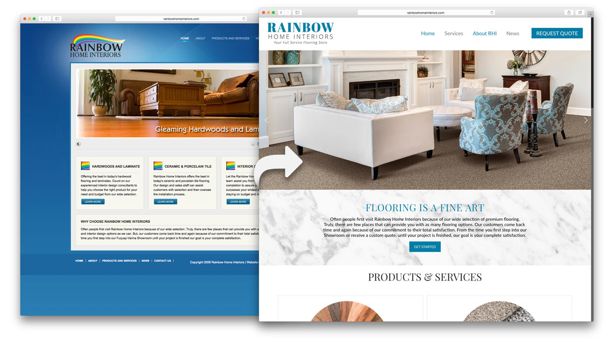
Every home page should have a clear message. If there are elements of design that distract from that message, visitors won’t do what you want them to do. Whether it’s clicking a button, filling out a form, or reading some text, your goal needs to be fully supported by every design element on your home page.
That’s a nice idea, but how can you put it into action?
- Think like a CRO expert.
View your home page objectively and determine what’s extraneous to your main message. Then, move those elements to another page or to the footer in order to cast a spotlight on the important parts. Every element must support conversion. Looking great isn’t enough. If it’s pretty but doesn’t help focus the eye on your message, get rid of it or move it.
- Take away distracting elements.
Sidebars are a prime example of distracting home page elements. That’s why you see lots of fully-loaded footers these days: it’s all sidebar material that’s been demoted to the footer in order to remove distractions.
- Use whitespace.
Don’t simply focus on what’s on your home page. Look at what’s not there, too. Whitespace is necessary to separate and highlight design elements and to give the eye a break. Need an example? Just about any page on Apple.com will show you the power of white space to focus and direct the eye. As Neil Patel states, “today’s average visitor is a skimmer and scanner”.
- Assess for too many CTA’s.
When a Dutch company reduced the choices on their landing page, their revenue shot up by 19 percent. They went from two to one CTA buttons and removed many of the outgoing links. Bounce rate dropped, conversions went up, and transactions increased as well.
- Keep it clean and use simple/minimal design.
3. Become a Visual Thinker
Even if you’re not a visual thinker, try to become one for the sake of good UX on your website. That means developing an eye for what works and learning how to master critical thinking.
The goal here is for a visitor to arrive and immediately make sense of your site. Can you train your own eye to think like a first-time visitor to your site?
Microsoft pointed out the importance of critical thinking in web design 16 years ago, and the principles still hold true.
4. Design Blank Slate Pages Better
Blank slate pages are those which will later be filled by the user but which are empty to begin with. Think of a page in the user’s account area. Your website may have functionality that allows customers to view their past orders. If they’ve never ordered, this page is empty.
Don’t just leave such a page empty, however. Give the user some clues as to what will go there in the future. This helps with onboarding, too, for those of you who are concerned about UX for applications.
5. Rethink Your Product Pages
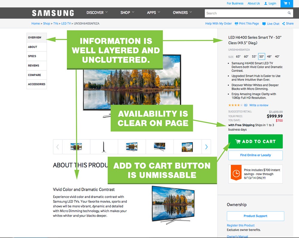
Think of a product page as a landing page to increase conversions. This also helps direct the visitor and makes it easier for them to get what they want. Many of the concepts here are identical to those described in Improvement #2:
- Have just one CTA.
- CTA should usually be located above the fold.
- Keep design simple so as not to distract consumers. Neil Patel describes this as making your content easily accessible.
- Use color to make CTA stand out (again, think visually).
- Having high-quality product images with ‘zoom in’ feature is helpful.
- After adding an item to the cart, customers should have access to a “continue shopping” button.
6. Use the Right Language
Visual design is key, but so are the words you use. Keep it simple and consider the target audience. For example, if you’re targeting seniors, don’t use slang. Use the right terms to describe older generations (old people isn’t generally well-accepted, while older Americans works). Do your research!
7. Reassure Visitors About Safety

Nobody wants to find themselves doing business with or taking advice from a website that’s not trustworthy. These days, consumers are fearful about security, so make them feel at ease with all the reassurances you can provide. These include:
- Trust badges
- Security icons
- Privacy statement
Case in point: When a furniture company added a security seal to its website, conversions increased by 7.6 percent.
This sounds like it’s about conversion, but the heart of the matter here is user experience. You see, UX isn’t just about smooth operation and easy navigation. It’s also about trust and authority. If the UX serves up a feeling of trust, that puts users at ease, which often means they’re more likely to convert.
8. Reassure Visitors About Values
Since 1994, when the pioneering business book Built to Last was first published, companies have considered the values statement to be de rigeur. This book stated that the most successful companies all adhered to a set of core values. Ever since, the values statement has been mandatory, for the most part.
Likewise, mission statements serve as important signals to consumers that a business stands for something. Therefore, for good UX, include the following on your site:
- Values statement
- Mission statement
The trick is to get your statements right. These days, consumers — especially Millennials — prefer doing business with companies whose values align with their own.
U.S. Millennials are more likely than non-Millennials to purchase items associated with a particular cause.
— The Boston Consulting Group
Tip: spend time on your values/mission statements. If they’re not carefully considered, they’re empty and meaningless. Once you’ve got your statements, make them easily accessible on your website.
9. Reassure Visitors that They’re in the Right Place
Let visitors know right away that you’re not going to waste their time. Show them that you know about their needs. Clearly identify your product/service and its key benefits.
When one company changed their website to more clearly state the benefits of the product, conversions increased. When visitors can immediately see benefits, they know they’re in the right place for satisfying their needs and desires.
10. Reassure Visitors That They’re Important
Be proactive about engagement. Offer several ways to get in touch, including social media. Include a statement about how important your visitors and customers are, and that someone will always be there to respond to inquiries.
11. Offer Detailed Info for Those Who Seek It
Don’t overwhelm on the home page but satisfy curious visitors who want to delve deeper into your company or your product/service. Offer resources such as:
- Case studies
- A blog
- Detailed product/ingredient/service analysis
- Video
- Infographic
Your visitors who crave deeper knowledge will appreciate it and as a result, they’ll come to trust your site more, too. By refraining from featuring the in-depth information too prominently, you’re also satisfying the basic UX requirements of simplicity and focus.
12. Get Rid of ALL Distractions
Everyone suffers digital overload, so make it simple and help your visitors focus on what they came for. Of course, knowing your customers helps with that, since it’s hard to predict desire if you don’t know who you’re talking about.
Advice: Develop some customer personas.
This tip goes deeper than simply removing visual distractions on your home page, which was mentioned earlier. You also want to remove messages that confuse the visitor about your value proposition. Offer too many, and they’re distracted because they can’t choose.
Again, those customer personas are essential for success here. That goes for everything we’ve discussed, actually. Remember Improvement #1: Consider Your Target Audience in All Your Design Decisions? After reading through these UX improvements, it should be clear to you just how important it is to know your customer well.
A Final Word on UX
If you’re thinking you’ve just learned a lot about conversion, then you’re absolutely right. UX is, after all, a major pathway to better conversions.
Think about it: What’s the goal of UX? Aside from a few philanthropic billionaires who want to make the (internet) world a better place, most people are trying to increase conversions.
Hopefully, you’ve now got some good tips under your belt for improving the UX, and eventually the conversion rate, of your website.
This is a guest post by Mike Khorev, who helps small and mid-size businesses generate more leads and sales and grow revenue online. He offers expert advice on marketing your company the right way through performance-based SEO, digital marketing, web design, social media, search engine marketing and many other online practices. Find him on LinkedIn and Twitter.
FAQs
An individual’s user experience (UX) is how they feel while interacting with a company’s website, web application, or other digital technology.
In a nutshell, UX aims to meet the needs of the user. It aims to keep users loyal to a brand or product by providing positive experiences. You can also define customer journeys on your website that are conducive to business success with a meaningful user experience.
UX design involves creating a digital product that is user-friendly. An UX strategy provides a plan. A UX strategy aligns a company’s brand identity with its desired customer experience. Before design begins, this plan should be in place.

Shubham is a digital marketer with rich experience working in the advertisement technology industry. He has vast experience in the programmatic industry, driving business strategy and scaling functions including but not limited to growth and marketing, Operations, process optimization, and Sales.

