We at AdPushup try to learn from the best and apply it to our work. One day, some of us got talking about our favorite blogs on the internet and what we thought made them so great.
That’s where the idea for this post came from… we wanted to deconstruct the most popular blogs in the world and figure out how they worked.
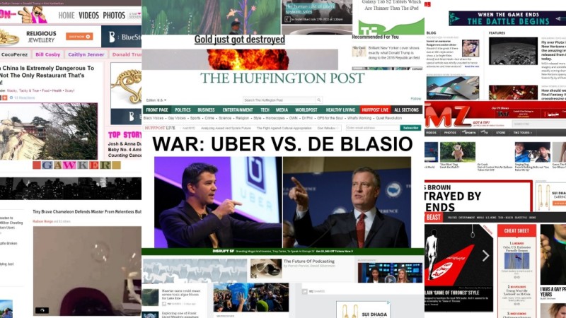
Everything from the big things to the small details. What CMS did the blog run on? What fonts did they use? What was their ad strategy? We learnt a lot in the process and we hope that you will too.
These are the blogs we chose to analyze based on the average of each blog’s Alexa Global Traffic Rank, and U.S. Traffic Rank from both Compete and Quantcast:
- Huffington Post
- Boing Boing
- TMZ
- Business Insider
- Mashable
- Gawker
- The Daily Beast
- TechCrunch
- Perez Hilton
- Engadget
Let’s get started.
Homepage

Did you know that typically 50% of all web traffic lands on the homepage of a website and it takes a visitor only 1/10th of a second to form an impression about your website?
Failure to impress at this stage is almost a certain way to alienate potential readers for good. Big publications know this more than anyone — after all, it’s their business.
So are there any tips or best practices we can draw from studying what they do? Let’s find out.
[easy-tweet tweet=”It takes a visitor only 1/10th of a second to form an impression about your website.” user=”adpushup” usehashtags=”no”]
Advertising
Well, no surprises here — 100% of blogs we analyzed use advertising to monetize their homepage — so much for all the never-ending talk about the inevitable and impending death of display ads.
Given, gradually declining CTR has decreased the overall revenue potential of display ads, but that doesn’t mean publishers are giving up on it just yet.
Seven out of 10 publishers also use alternate monetization strategies such as native advertising and content recommendation systems such as Outbrain and Taboola to supplement display revenue.
Social accounts
With the exception of Gawker, all other blogs had their social media accounts displayed somewhere on the homepage — some more prominently than the others.
Gawker, along with many of its sister blogs such as io9, Jezebel, Lifehacker, Gizmodo, Deadspin, and Kotaku run on Gawker media’s proprietary Kinja platform, which hinges on a minimalist design philosophy and has as few elements on the homepage as possible and no more.
Out of the nine blogs that did feature social accounts, only Facebook and Twitter were common to all, the third most common being Google+.
Other social accounts displayed included Tumblr, LinkedIn, Instagram, Pinterest, Vine, YouTube, and Stumble Upon.
A balanced approach here is probably the best way to go — not over clutter the homepage with 10 accounts, but definitely display the most important ones such as Facebook, Twitter, and Google+.
User account management
70% of the blogs we analyzed feature a user account management system where users can register, create profiles, and manage their subscriptions among many other things.
The decision of whether or not your blog needs a user management system largely depends on your specific aims and objectives:
- Do you want to want to crowd-source your content?
- Do you plan to run a forum for user interactions?
- Do you want users to be able to privately message each other?
If yes, then you need a user management system. While in some cases, user management systems are custom made for the purpose, there are plugins available for WordPress that you can just install and use right out of the box.
These plugins allow functionality such as registration, reset password and edit profile, content restriction, user badges, guest post support, subscription management, and more.
UserPro is an example of one such plugin. If you’re looking for a free alternative, try WP User Frontend.
Subscription
Email and RSS subscriptions are a great way to build a captive audience for your blog – some blogs display the subscription boxes in the sidebar or a similar prominent place, while others use a popup to the same end.
Surprisingly, none of the blogs that we analyzed as part of our study list utilized a popup, maybe because the general perception is that popups are annoying. 7 out of the ten offered users a subscription box, out of which 4 offered both email and RSS subscriptions, 2 offered only email, and one offered only RSS.
Practically speaking, there’s no real reason why you shouldn’t be offering your readers subscription options, whether you do that by popup or by a box is something that depends on the trade off between potentially higher subscription rate and the chance of annoying a part of your readership.
Icegram, OptinMonster, and Privy are good options if you want to set up a popup based email subscription box on your blog.
If you want to use a subscription box instead, the first thing you’ll need to ensure is that your theme supports sidebars – if not, you’ll probably either need to change the theme or modify it to support them. Once that’s done, you can either use the default subscription box that WordPress provides or use a plugin such as Simply Subscribe if you need more features.
Top navigation
Eight out of 10 blogs we analyzed (exceptions being Boing Boing and Gawker) feature a prominent top navigation menu using which the readers can easily browse content.
Having a top navigation menu does lend a sense of familiarity to any blog since we’re used to seeing information online in a particular way — so sometimes a navigation menu becomes conspicuous by its absence. But that doesn’t mean you have to have one.
For instance, if you focus more on quality than quantity and your design is minimalist — you can get away without using a top navigation menu — many blogs do. It’s good to have but not necessary.
Sidebar
Once a default feature of almost all blogs, sidebars are becoming less and less common with more modern designs taking its place. Although sidebars can be quite useful functionally: You can use them to display subscription boxes, display ads, popular posts, and social accounts among other things. In the blogs that we analyzed, six out of 10 used sidebars.
Design

As someone famous once said, “Design is not just what it looks like and feels like. Design is how it works.” (Psst: It was Steve Jobs.) This couldn’t be more apt for blogs — a design that’s pleasing to the eye, though a necessary part of good design — does not wholly constitute it.
How user-friendly is the interface? Is the blog easy to navigate? How is the overall user experience? These are the questions that design concerns itself with. Let’s look at how these blogs fared at some of the most common design indicators.
Responsive
Response design is definitely amongst the biggest web design trends of the last decade. And if you thought that it’s just another one of those buzzwords, think again — implementing a responsive design on your blog or website will significantly increase its usability.
So what is responsive design? Quite simply, makes content more uniformly accessible across different devices and screen resolutions. For instance, if you try to view a non-responsive blog on a small screen, you will probably need to do a lot of panning and scrolling to get anything done — responsive design eliminates this problem by keeping the design elements fluid, i.e. depending on the window size of the browser or the screen resolution of the display device, the content will automatically resize itself for a seamless viewing experience.
Coming to the blogs we analyzed, five out of 10 featured a responsive design. It’s interesting to note that the blogs that did have a responsive design (Mashable, TechCrunch, Engadget…) are the same ones that also cover technology as one of their beats, as opposed to business or celebrity blogs (Business Insider, TMZ, Perez Hilton…). Although it’s worth noting that those who don’t have responsive designs have mobile versions instead — it’s not ideal but it’s definitely better than nothing.
[easy-tweet tweet=”Five out of 10 websites in our sample featured a responsive design.” user=”adpushup” usehashtags=”no”]
Seems like the common theme uniting the latter group is that they simply don’t know better. Ideally, you don’t want to be in that group in 2015, when more people access the internet using mobile devices than PCs.
As a blogger, the quickest way to go responsive is to purchase an out-of-the-box responsive theme and just customize it to your specific purpose. You can also hire a designer to create a theme for you, but it’s a trade off because all that custom development comes at a higher price.
Content Management System
Content management systems serve multiple purposes: They allow users with little or no knowledge of programming and markup languages to manage a website; they act as a repository for all media assets such as page content, metadata, images and videos; and incorporate the functionality to collaborate, manage documents, and enable multiple author editing and participation.
Among the blogs that we analyzed for this post, three (Boing Boing, TechCrunch, TMZ) were found to be running on WordPress, six were running on a custom design, and Gawker of course, ran on its own platform Kinja. Custom designs are tailor fit according to your specific requirements, but this comes at cost that’s significantly higher than most out-of-the-box content management systems (most of which are actually free).
There are many out-of-the-box content management systems in the market, but possibly the most widely used by bloggers is WordPress — which is used by over 60 million websites including CNN, Bloomberg, The Rolling Stones, MIT, Vogue among many others.
Setup is really simple, all you need to do is download the package and install it on your server. WordPress has a large developer community constantly creating new plugins and themes for it, making it extremely customizable.
As mentioned before, there are many other options to explore when choosing a content management system for your blog; Drupal and Joomla, two of the other largest content management systems and WordPress’s direct competitors, are also worth looking into.
Other than the established players, there’s a slew of new entrants such as Ghost, Wardrobe, and Dropplets who are making their presence felt — although they tend to sacrifice features in favor of simplicity, which can be a good or a bad thing depending on what you need from your blog.
Page load speed
Although more an indicator of good design rather than a feature of it, page load speeds have a significant impact on a website’s user experience. In an age where information is ubiquitous, users generally have little patience for a page that takes too long to load — so every passing second counts.
A study by Akamai found that 47% of people expect a page to load in two seconds or less while 40% abandon a website that takes more than three seconds to load. Therefore, slow page load speed is like digital suicide for content producers.
We measure page load speeds with Pingdom Tools using New York as the location for all tests to ensure consistency, you there are many other tools such as YSlow and GTMetrix that you can use for the same effect too.
In our tests, two blogs loaded under two seconds, five loaded under five seconds, and the remaining three took over five seconds. Recorded minimum and maximum were 1.06 seconds and 13.8 seconds respectively. The average page load speed of all the 10 blogs came out to be 5.63 seconds, which isn’t bad considering that Google estimates the world average to be around 7 seconds, but it isn’t ideal either.
In a best case scenario, your page should load under two seconds, any more than that and you start losing readers. Here’s a guide from Crazy Egg on how to reduce page load speeds and here’s another from Sparring Minds that was specifically written for WordPress.
Comment system
Most content management systems come with their own commenting systems, but they’re not particularly feature rich, which led to the development of many third party specialized commenting systems with social logins, nested comments, and more features.
Two of the blogs we analyzed were using Disqus as their commenting system, two were using Livefyre, two were using Facebook comments, two were using a custom design commenting system, and two used no comment system at all, which works if you don’t need discussion around your content or if you don’t yet have significant traffic.
In terms of functionality, both Disqus and Livefyre are quite similar; although, the latter has a slightly slicker interface. Facebook comments have a unique advantage in that they can make the commenting process quite friction-less as anyone who is logged into their Facebook account (hint: almost everyone is, all the time) can just leave a comment without requiring to login again. Another strong contender, though not seen in this list, is IntenseDebate — created by Automattic — the same people who built WordPress.
Content recommendation systems
Shrinking ad revenues caused by declining CTRs across the board have forced publishers to try out more innovative ad practices such as ad testing, ad optimization, and native advertising.
Content recommendation is one such forms of native advertising that has become really popular with online publishers in recent years. Although it works on the same principle as display advertising, where the advertiser pays a certain amount to the publisher on a per click basis, it’s the nature of ads that differs — basically, the sponsored content is created to look less like an ad and more like something of genuinely to value to a reader, thus increasing overall engagement and revenue.
70% of publishers in our sample use some or the other content recommendation system, proving that this is no passing trend. Among the ones that did use a content recommendation system, three used Gravity, two used Outbrain, and two used Taboola. Here are some other ad networks that you can consider too.
Typography

Some would argue that typography is really just a part of design and should therefore fall under it. And while we agree wholeheartedly with that, the goal of keeping it as a separate section in this post is only to emphasize its relative importance in the larger scheme of things. You could have the best design and yet it will all fall flat if you have bad typography.
Font type
During our analysis, we only looked at fonts in the body copy because that’s where the reader spend their most time on any website — this is not to be taken as a sign that body copy fonts are more important than headline fonts, the latter are just as important.
We only did this because understanding the dynamic of the two is beyond the scope of this article, although Smashing Magazine has this excellent guide on anyone looking to gain a better understanding of it. Four out of 10 blogs in our analysis featured a Serif typeface, while the majority went with Sans Serif. Interestingly, in all four cases of the Serif typeface, the font used was Georgia, whereas the Sans Serif family saw much more diversity with the use of Verdana, Ariel, Helvetia, Open Sans, Verdana, and Segoe UI.
Font size
The second most important aspect of typography after the typeface and font itself, font size can play an important part in the overall readability of content. The smallest font size observed was 14px on Perez Hilton and the maximum was 19px on Business Insider, with the average font size being 15.8 px. As a subjective opinion, it was the largest font size as seen on Business Insider that looked the most readable without looking too big.
Aside from the few outliers, a majority of the blogs opted for either 15px or 16px as their choice of font size. Whenever possible, size 16px or higher should be opted for as a rule of thumb.
Content

Last but certainly not the least, we looked at the length and relative difficulty (or ease) of comprehension with respect to the content.
Post length
Due to the extreme variation in post lengths where one post could be a 100 word update and the next could be a 4,000 word think piece, it was difficult to ascertain a post length that was reflective of a blog or demonstrated a trend, so we looked at the last five posts from each blog and calculated their average to arrive at an indicative number.
The average post length for all blogs turned out to be 518 words per post. TMZ, Perez Hilton, Gawker, and Engadget all had an average post length of under 300 words per post — this makes sense because the first two focus on publishing small snippets of celebrity gossip and the latter two have a heavy focus on curation. All the others have an average post length of over 400 words with Boing Boing, Mashable, and the Daily Beast clocking in the highest at 738, 784, and 1205 words respectively.
There’s a lot of debate about what the average post length should be — some say it should be no less than 1500 as it helps with better search rankings, others say it should around the 2000 mark, and yet others claim that the sweet spot is 2500, but these blogs prove that blog length is not the only yardstick real-world performance — although admittedly they all have a post frequency much higher than your average blog. Here’s an interesting take on the subject by Neil Patel, which essentially states that you shouldn’t restrict yourself to any hard and fast rules.
Ease of reading
The second thing we measured as part of our content analysis was the ease of reading. We used the widely accepted Flesch–Kincaid reading scale to measure the blog content. As with post length, we first calculated the score for the last five posts for each blog individually and then took an average to arrive at an indicative number. Here’s the scale:
- 90.0–100.0 easily understood by an average 11-year-old student
- 60.0–70.0 easily understood by 13- to 15-year-old students
- 0.0–30.0 best understood by university graduates
As you can see, a higher score means that the text is easier to comprehend and a lower score indicates that it’s tougher. The average number we got for all 10 blogs is 67.73 with Business Insider being the highest on the scale at 83.3 and TechCrunch being the lowest at 57.64 — all blogs fall within a range that’s quite readable according to the scale.
It’s difficult to know if this is a conscious effort on part of the editorial teams of the blogs, but chances are that such a thing is not an “accident”. A high score obviously has the benefit of being accessible to a larger group of people as proficient readers can read easy text but relatively unskilled readers will struggle with complicated text.

Shubham is a digital marketer with rich experience working in the advertisement technology industry. He has vast experience in the programmatic industry, driving business strategy and scaling functions including but not limited to growth and marketing, Operations, process optimization, and Sales.


